Here is part three of our three part series on the Art of StarBreak®. Last week we discussed some of our tricks when dealing with enemies. This week, we will touch on our process for environments.
PART 3 - ENVIRONMENT ART
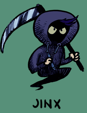
Hey all, my CODE NAME at work is Jinx. I'm responsible for the environment art in StarBreak. I was considering going into some mechanical list of our process, how we put art in the game, position it, make it wiggle and glow... But I think that kinda stuff can get boring if its not what you do for a living.
One of my favorite parts of working at Crunchy Games is how collaborative our process is, and how we occasionally have the luxury to really battle through a design when things are not exactly what we are looking for the first time. I want to walk you through what I consider my greatest battle and victory in StarBreak so far. In this write up, I'll cover our whole process for concepting a level and how the final art is broken down into in game assets. Our maps generally begin as a spark of divine inspiration in one of our developers’ heads, though recently we have been grouping up to discuss themes and mechanics as a precursor to any brainstorming or concepting for the art team or dev. team.
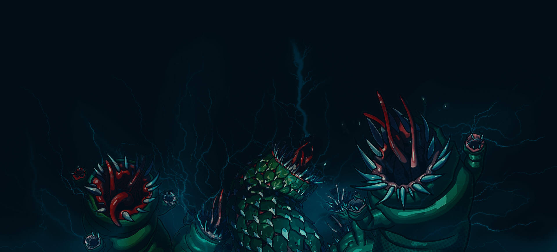
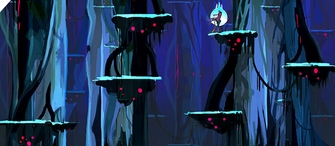
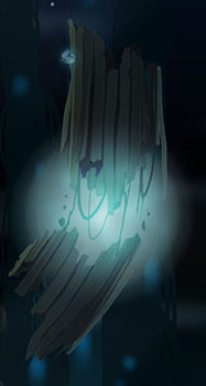
This one though, "The Strands" was a divine spark. One of our earliest attempts at the first area, the Fire Forest had featured some gigantic trees that lined the entire level. The trees ended up becoming a problem though. It was too hard to control the groups of players flow through the zone and eventually we ended up removing them entirely... but those huge ominous trees remained in the back of all of our heads until several maps later in what would become our 5th zone they were proposed again as the overall theme of the level.
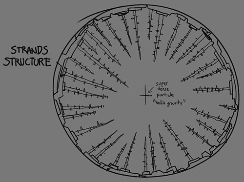
I think the general idea that was pitched was just a zone made entirely of gigantic trees, and that there would be no floor. After tons of brainstorming on the whiteboard we reached some general concepts about how the environment was built which would be enough for me to start drawing visual treatments. The concept went something like this: The world was a hollow shell with sort of a gravity pit center. The foliage that grew along the shell was pulled down to the center, creating long tendrils of plant/organic matter. At the roof of the level, you'd see the edge of the shell, and the bottom of the level led to the gravity pit. If you fell off, you'd be pulled into the center and die instantly.
With these ideas in mind, I started sketching some initial concepts for the large trunks that would be the main visual element of the level. The first sketches for Strands were done on my phone during my train ride to work. I use a Samsung Note 3 with a program called Artflow.
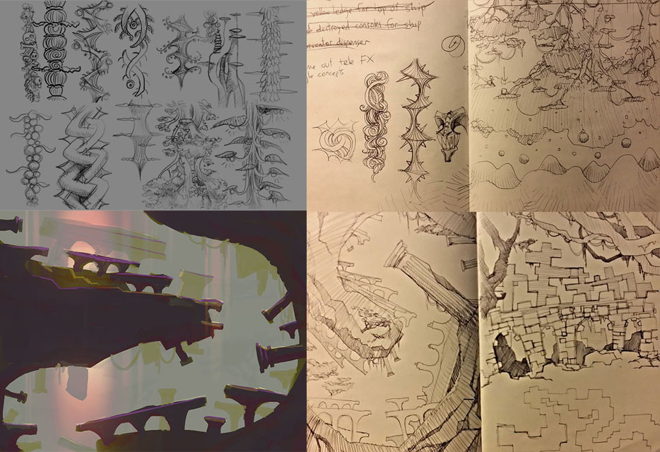
After we had some shapes we were into, I began to rough out an overall slice of what the level could look like in Adobe Photoshop.
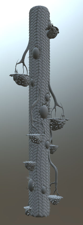
Some early feedback led me towards covering the large trunks with scales to get a more alien look going.
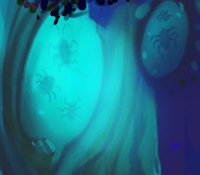
The early Strands had these large egg shapes that would have been full of silhouettes of smaller insects. Creepy right?
We were pretty comfortable with the way things were looking, so we started moving forward with this direction. To get some really clean shapes and accurate lighting going, I made the main trunk in Zbrush so we could have a good base asset that would be easy to adjust.
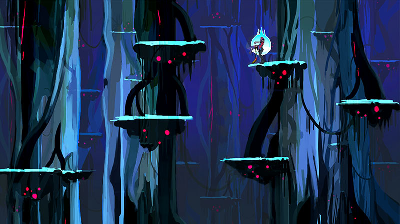
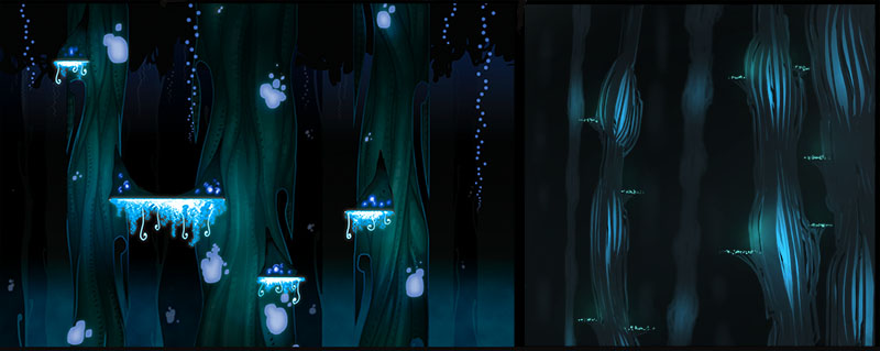
I composited the early models into the original concept painting so we could see how they play off the environment. After a lot of tweaking, it was decided that the scales were just too visually noisy and the shapes were just not all there. In general, Ransom wanted a more serene feel for the level and it wasn’t coming across. This led to more rough concept paintings... which started getting some really interesting visuals going.
Two in particular really seemed to resound with everyone. The long grooved trees with glowing centers gracefully fit most of our requirements for this strange inverted world. The cool blue lit platforms from other second concept (by Ransom) ended up as the final ledges in the level.
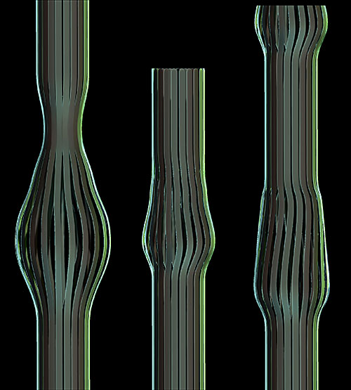
Back in Zbrush, a model of the new tree was made, with several variants.
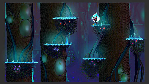
I had to work with Dev. pretty extensively to figure out how we'd place the assets. In the end we decided to implement a new system that allowed us to separate ledges and midground objects. This meant I could go wild with the giant tree trunks and not have to worry about how they would line up with the ledges.
The first versions of the trunks were too stiff. I was overly concerned with making the tiles do most of the work and trying to preserve sprite sheet space. Eventually, we knew if we wanted those big winding curves from the concept art, I would have to make assets with big winding curves and really hit the sprite sheet hard. This was a concern because Comet was in the middle of designing one of our biggest and baddest bosses at the time.. the dreaded Polaris, who would also need to share the sprite sheet.
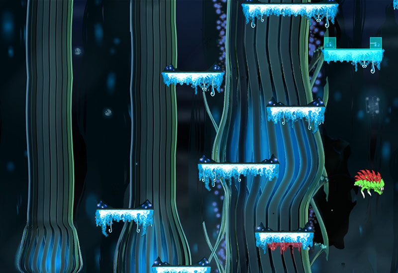
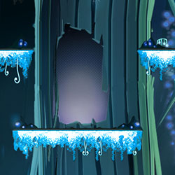
The next version of the trunks were getting there but still lacking that flow from the concept. After more fiddling with the tile system I was able to bend them in a way that resembled the concept art. The ledges fell into place quickly since Ransom had already given some really good insight on how to pull them off. Doors were another kind of conceptual challenge that seemed a lot harder than it actually was. By just inserting a hard edged dark door in the center of a large trunk, the entrances and exits looked totally awesome and seamless. It was a much needed miracle.
I spent a few more days adding decorations that would line the edges of the trees, painting the low quality version of the map for slower computers. The air would be filled with these weird slow floating macro planktons, to help things feel more alien and serene.
Once everything was in place, I began creating variant themes for each map so players could know how deep they were in the dungeon and how close they were to the boss doors. (we didn't have actual boss doors back then! You just had to KNOW what door would lead to the boss...)
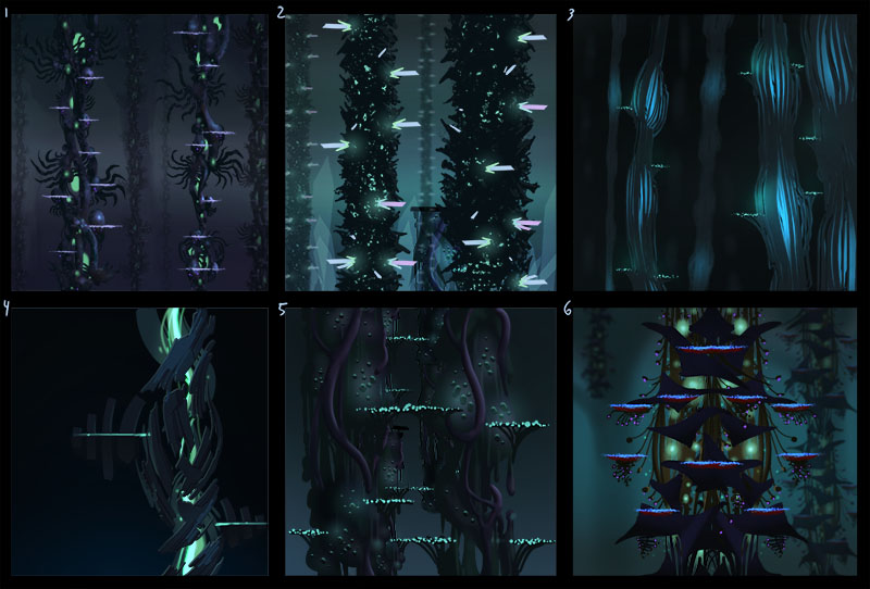
- The first map was regular with no variations.
- The second map was all about a misty and steaming area of the zone.
- The third map was wet and rainy. It was a lot of fun animating all the droplets and waves of water rolling down the trunks. Its one of my favorite maps in the game because the atmosphere is so unique. Also I'm fond of rainy days...
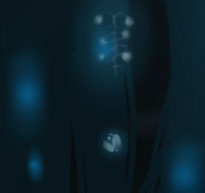
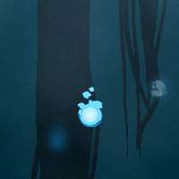
- The fourth map is the firefly map. Tons of yellow glowballs hover slowly around the giant trunks. I darkened most of the map so that the fireflies could stand out more.
- The fifth map was a briar thorn roots kinda thing. By letting the procedural engine cover the trunks to a certain frequency I was able to get some really neat looks.
- The sixth map was a damaged trunk area originally, but it looked sort of cheesy. We ended up going with more of a fungus spore diseased plant theme.
The final touch was adding in large floating trunks that had broken off from the main shell.. large slow moving shapes really helped sell that sense of calm we were going for. funny enough, when I'm playing on that map, I feel anything but calm! The mechanics are a stark contrast to the visuals.
By the time we got all the monsters in map and were able to take in the level as a whole, it instantly became my favorite. It was certainly the hardest because there was so much searching involved along with some technical hurdles, but in the end I'm filled with a sense of pride every time I enter the map.
Then shortly after I usually fall to my death~
Thanks for reading, and see you next time~! -Jinx